I can't believe how long it has been since I posted anything on my blog.
Miss 5 has taking a liking to playing the free games online at ABCkids, so it has been a bit of a battle over who gets the computer - I normally give in and let her play it. Hubby now has started his new job, so I've just inherited his laptop which he no longer requires - it's nothing fantastic being about 3 years old and all, but it is compact and portable - yay! The last time I was using a laptop was when I was teaching - got to love writing out all those lesson plans and reports (NOT!).
We recently bought a new printer, which is proving to be a total gem. We have had our old Brother multi-function for a long time... probably 5 years? It was a good printer (for a 5 year old printer that cost $100 at the time) and served it's purpose well but the quality wasn't any good above a standard printed document. Of late I have downloaded a heap of digital paper files with the intention I could print some of them and use on cards and layouts, but it just wasn't working. It was a bottom-feed printer and struggled with anything thicker than printer paper, and it refused to take my A5 cardstock (and I couldn't get my hand in far enough to help it grip onto it and push it up and into the rollers)... so we decided we could upgrade to a decent printer. After much research online I came down to a list of 2 Canon and 2 Epson printers. After further comparing properties of each we decided on the Canon MP990 - which is a multi-function suitable to print photos and also scans negatives and slides (which was really the clincher for me, having all of our wedding photos as negatives). It prints lovely quality photos (clear/crisp and great colour) which I am loving!!!
I also received a pressie in the form of Photoshop Elements 8 from my parents-in-law, so I've been having a bit of a play on that of late, which has been eating up my craft time. I really need to set aside some time to learn all the functions to get the most out of it, but the little bit I have done is awesome. I was totally hooked after I downloaded the 30 day trial at the start of the year.
I hope to get creative this afternoon after I drop Miss 5 at kinder and while Miss 1 is having a nap. I now need to channel my inner mojo...
I'll be back!
Monday, August 30, 2010
Saturday, August 14, 2010
Colour Create Challenge 51
The Colour Create Challenge 51 is to use Ivory, Duck Egg Blue and one other colour from the inspiration picture:

(Picture from Colour Create Challenge Blog)
The book second from the left reminded me of the Tim Holtz distress ink colour Pumice Stone, so I set about using that as my 3 colours.

I started with an Ivory card base that I cut a scalloped border along the bottom, which I then stamped with the Dotty Stars Border stamp by Kaszazz, using Ice Blue Colorbox Chalk ink. I then edged the card with Pumice Stone and Broken China T.H distress inks. I cut a strip of ivory card, ran the paper distresser over it, and used the same distress inks to colour it all over. I double stitched the top and bottom of the strip before adhering it to the base card. I used an accent strip I've had in my stash since forever to cut the circle of baby hands out, which I ran the distresser around and inked slightly with the distress inks. I then mounted it onto another piece of ivory cardstock and freehand cut around the blue circle - which has any imperfections covered up by also running the paper distresser around. This circle piece is attached with Magic Mount, and the card was finished with 3 pearls.
If you are interested in getting your hands on any of the products in italics mentioned above, feel free to email me at rachel.witthaus@gmail.com - I can send to anywhere in Australia.
Tuesday, August 10, 2010
Etch-a-sketch take 3
Yes, here is take 3 of the photo, turned into a sketch, which became a card.

I blended some of the Tim Holtz distress ink in Victorian Velvet around the card base before adhering the bits and pieces. Sadly, that is the last of that patterned paper. I used the rest of it to complete our wedding album. Shock horror - it only took 7 years (next month)! I started the album way, way back in the days after I discovered scrapbooking, which was almost 6 years ago. It is done in the 'old skool' CM style - with a paper strip down the side of the page, the photos and a title. I actually like it for the wedding album - each page is plain black with a few accent colours. The only problem is that my style has changed SO much, I found it hard to make it look right. I guess that's what I get for not getting the last of those negatives printed and put in the album. Well, it's done, and yes the paper is gone... I nearly feel relieved that piece of paper it isn't in my stash any more. Like it has grown up and found a new home :)

I blended some of the Tim Holtz distress ink in Victorian Velvet around the card base before adhering the bits and pieces. Sadly, that is the last of that patterned paper. I used the rest of it to complete our wedding album. Shock horror - it only took 7 years (next month)! I started the album way, way back in the days after I discovered scrapbooking, which was almost 6 years ago. It is done in the 'old skool' CM style - with a paper strip down the side of the page, the photos and a title. I actually like it for the wedding album - each page is plain black with a few accent colours. The only problem is that my style has changed SO much, I found it hard to make it look right. I guess that's what I get for not getting the last of those negatives printed and put in the album. Well, it's done, and yes the paper is gone... I nearly feel relieved that piece of paper it isn't in my stash any more. Like it has grown up and found a new home :)
Monday, August 09, 2010
Etch-a-sketch take 2
As is becoming a bit of a habit, I recreated the last card but changed it slightly.
This time I blended some of the Tim Holtz distress ink in Walnut Stain around the edges of the ivory cardstock before adhering the patterned paper and other bits. I also swapped the ribbon.
Here is take 2:

I think it gives it a totally different feel - perhaps warmer?
You'd better stay tuned, there will be a take 3.
Sunday, August 08, 2010
Etch-a-sketch
I knew there was a reason I continually read the blogs that get miraculously delivered to me via Google Reader. During the week I saw a post with some photos from CHA - the American Craft and Hobby Association Trade Show. This is the expo of all the new products being released from some of the biggest names in the craft business. It gives you a good idea of upcoming trends and styles. I noticed the photo on the blog of Embellish Magazine of a booth called DeNami Design (which I have never heard of before). It showed a collection of cards and there were a few that appealed, so I drew some quick sketches of them to re-create. Here is the photo of the card that caught my eye (taken from the Embellish Magazine blog):

And here is what I turned it into:


And here is what I turned it into:

I used an ivory card base, with some gorgeous flocked patterned paper from Sullivans, that I have been hoarding (A.K.A had for years). It was one of those pieces of paper that was just too pretty to cut... well, I did it! There was a moment of hesitation when I made the first cut, but there was no looking back. I blended some Tim Holtz distress inks in Walnut Stain and Victorian Velvet over some extra ivory cardstock and cut out 2 circles, which I then ran the edge distresser around (just once in the same direction, to give it a rough look without fraying it), and re-inked the edges where the card was exposed. I chose those colours to try and match with the patterned paper. Finished with a ribbon bow and some small pink pearls.
Saturday, August 07, 2010
Bright and Funky
I have had this piece of patterned paper sitting in my stash for longer than I care to admit. I obviously bought it in one of those "moments" and when I got it home I wasn't really sure how to use it. I paired it with some green Bazzill Bling cardstock and some silver glitter on the butterfly, which I had punched out of double sided sticker paper (JAC).

Simple. Not my usual style (I much prefer those muted tones), but I quite like it. You never know, I might be taking a liking to these bright colours.

Simple. Not my usual style (I much prefer those muted tones), but I quite like it. You never know, I might be taking a liking to these bright colours.
Friday, August 06, 2010
Emboss Resist with Smooch - take 3
Curiosity got the better of me, so I had to try the emboss resist on glossy cardstock. Because of the gloss finish, the ink doesn't soak in as much when you blend it with the ink blending tool, giving an overall lighter finish than the others. This time I used Tim Holtz distress ink in Stormy Sky.
Ok, enough with the Emboss Resist.
Moving on...

Ok, enough with the Emboss Resist.
Moving on...
Thursday, August 05, 2010
Emboss Resist with Smooch - take 2
Because I could get 2 circles out of the A5 cardstock I had clear embossed, I used the Tim Holtz distress ink in Victorian Velvet to make another using the same techniques as the first. This time I stamped on the card as well, which according to my husband looks better than the "blank" one. I informed him that it is known as 'white space' and he looked at me (in a kind of "are you serious" look) and went "it's just empty". Ok, each to their own.

This one uses a Haus Designs Value Pearl/Clear Bead Pin as my embellishment. I have added a drop of Glossy Accents to the end of pin so that it no longer has a sharp tip. I'm really loving this emboss resist technique - it adds so much character to the card and best of all it is quick and easy! I'm going to have a go of this technique on a gloss cardstock and see how it turns out (my base cards were gloss, but the embossed card was matt finish).
Today is the last day to enter the Haus Designs pin giveaway - make sure you link up a project that you think a pin would look good on!! At the minute you have a VERY good chance of winning!!!
Monday, August 02, 2010
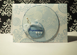
Emboss Resist with Smooch
This week on the SplitCoastStampers website they have a tutorial using emboss resist and Smooch Spritz - which is right up my alley. Of course I can never follow instructions exactly... I like to put my own spin on it.

2. Using a cutting tool, cut a circle to fit the cover of your card. I used my old CM circle cutter, using the outside of the smallest circle and the red blade. You could also use a Nestabilities die or simply trace a circle around a cup, saucer, cookie cutter, etc.

3. Using a distressing tool, rough up the edges of the circle - this will add a bit of a vintage/shabby feel as well as absorbing more ink in the next step to give a darker edge.

4. Using a Ink Blending Tool, blend on ink so that it is slightly patchy - you don't want an even look. I used the Ranger Ink Blending Tool with Foam and Tim Holtz Distress Ink in Pumice Stone - both available from Kaszazz.

5. Using a colour catcher, mist the card with Smooch Spritz. I use a large shoebox (my hubby has size 12 feet) as my colour catcher. I used Smooch Spritz in Spun Sugar which is a kind of bronze colour. The pearlescent pigment in it is a light pink but doesn't show up as pink when you spray it.

6. Using a dry soft cloth wipe the card in circular motions to rub any of the spray off the embossed images. I used a dried out baby wipe.

7. Embellish as you want. I used some of the white grosgrain ribbon from Kaszazz that I did in a kind of double layer across the card front. I then stamped my sentiment on a small piece of white card using the same ink as I blended with, rounded the corners and added a Haus Designs pin that I tied a little bit of satin ribbon around. The sentiment is foam mounted on the circle, and then the circle is foam mounted on the card front.


As a shameless plug, please visit the Haus Designs blog and leave a comment showing a project of yours to enter the first Haus Designs pins giveaway which closes on Thursday 5th August.
P.S I ran out of cotton as I was sewing up my project (which I wanted to have finished by now), so I will have to visit the local craft shop... to get more thread of course... ;)
Here's what I did:
1. Stamp images with an embossing pad and stamps, coat with clear embossing powder and heat set with a heat tool. I used the Kaszazz Treasured Memories stamp set for this.
2. Using a cutting tool, cut a circle to fit the cover of your card. I used my old CM circle cutter, using the outside of the smallest circle and the red blade. You could also use a Nestabilities die or simply trace a circle around a cup, saucer, cookie cutter, etc.

3. Using a distressing tool, rough up the edges of the circle - this will add a bit of a vintage/shabby feel as well as absorbing more ink in the next step to give a darker edge.

4. Using a Ink Blending Tool, blend on ink so that it is slightly patchy - you don't want an even look. I used the Ranger Ink Blending Tool with Foam and Tim Holtz Distress Ink in Pumice Stone - both available from Kaszazz.

5. Using a colour catcher, mist the card with Smooch Spritz. I use a large shoebox (my hubby has size 12 feet) as my colour catcher. I used Smooch Spritz in Spun Sugar which is a kind of bronze colour. The pearlescent pigment in it is a light pink but doesn't show up as pink when you spray it.

6. Using a dry soft cloth wipe the card in circular motions to rub any of the spray off the embossed images. I used a dried out baby wipe.

7. Embellish as you want. I used some of the white grosgrain ribbon from Kaszazz that I did in a kind of double layer across the card front. I then stamped my sentiment on a small piece of white card using the same ink as I blended with, rounded the corners and added a Haus Designs pin that I tied a little bit of satin ribbon around. The sentiment is foam mounted on the circle, and then the circle is foam mounted on the card front.


As a shameless plug, please visit the Haus Designs blog and leave a comment showing a project of yours to enter the first Haus Designs pins giveaway which closes on Thursday 5th August.
P.S I ran out of cotton as I was sewing up my project (which I wanted to have finished by now), so I will have to visit the local craft shop... to get more thread of course... ;)
Subscribe to:
Posts (Atom)