Friday, January 29, 2010

Sketches! Challenge #104

I'm a bit slow with this one seeing as today is Friday here in Australia, but we have been away camping since last Friday and I'm just getting back into everything. It's amazing how a change of routine throws everything out!

This week over at Sketches! it is a Journalling Challenge - the task was to:
Journal about something in your life that you have
overcome. It can be something very personal and of great importance or something that was a big moment or change in your life. Or it can be something that is more light hearted,
maybe not a huge ordeal in your life but still a situation or something that you had to overcome and make it through to get
to where you wanted to be or to accomplish what you wanted to accomplish.

So, my take on it was to journal about my graduation from university. For me it was a little harder because I had to go back to uni when Emily was a baby so I could finish my course. I had to overcome my own mindset and just DO IT! I'm definitely glad I did :)
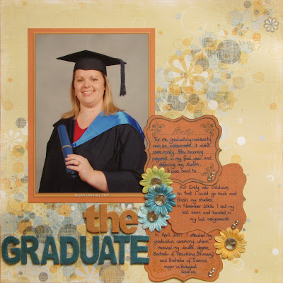


I guess it's funny that I love journalling, and have at least a paragraph on 99% of my pages, but when you are given a challenge to journal about something in particular it becomes so difficult! I think I have been quite blessed that there hasn't been too much hardship in my life so far, and for that I can be grateful.

If you have a photo of something you have overcome and could journal about please share it with us over at Sketches! Don't forget to check out all the other DT members pages too - very diverse. Thanks for reading :)

Wednesday, January 20, 2010

Sketches! Challenge #103

Being the 3rd Tuesday (well, it's Wednesday here is Australia) it is a card sketch over at Sketches! I totally love this sketch - it is so easy to work with, and the other DT ladies have all produced something totally different from it which just proves it is very versatile.
So this is the sketch:
And here is what I created with it:

Everything you see is available from Kaszazz except for the Fiskars border punch (threading water).
I thought that it would be nice to try masking - if you haven't you need to! It is so easy and it gives such a great result without using layers. For the main butterfly section I stamped the butterfly using Chocolate Ancient Page ink - which is a waterproof ink so it won't bleed. I then used the Tim Holtz distress ink pads and ink blending tool to colour what I wanted on the butterfly (it doesn't matter if it colours out of the butterfly as this will be covered) then you need to stamp and cut out another butterfly - preferably on a sticky note or you can use non-permanent tape and position this butterfly on top exactly over the one you've coloured. Then you can go nuts with the ink blending tool over all of the rest of the card (just make sure the mask doesn't lift). The mask protects the underneath part so it will then stand out when you take it off. It really is that easy! Ink colours I used were Shabby Shutters, Peeled Paint and Vintage Photo. I think it gives it a nice mottled look. There is also a strip of Bazzill under the main part which was stamped using the Rollagraph and Dagwoods wheel - I LOVE that wheel, it is so pretty with the butterflies and flowers!
Thanks for checking out my blog - please leave a comment, and don't forget to upload your creation using this card sketch over at Sketches!

Friday, January 15, 2010

Colour Inspiration

I was flicking through some catalogues the other day from homeware stores (Kmart, Target, Harris Scarfe) and couldn't help but notice the bedding and the colours. I then realised that I had never paid much attention to the catalogue photos before, but I have seen some challenge blogs where they post pictures of a bedroom or lounge room and get you to use the colours as a basis for a card or layout. I couldn't help but think "that would make a great card"!
I've only been looking and following craft blogs for about a year now - before that it was only via magazines and groups that I was a part of. I mostly drew my inspiration from elements or other layouts I had seen. There is so much variety in what we can access now as far as craft and getting ideas.
Speaking of inspiration, SplitCoastStampers - one of the most popular cardmaking and stamping website/forum/galleries online - has a tutorial of easel cards this week, and curiosity got the better of me. I'd never made one before and I have a bit of a thing for 'unusual' at the moment, so I gave it a go. I used the basic principle of fold in half and half again on one side, using a standard A5 piece of card that had been trimmed to 5 inches wide.

So here is what I came up with:


All elements are from Kaszazz - including the NEW mini messages stamp that is part of a 9 stamp set. If you want to see the rest of the stamps, you'll need to come on Monday to the new product demonstration night. Email me for more info!

Wednesday, January 13, 2010

Sketches! Challenge #102

Being the second Tuesday of the month, it is a recipe challenge over at Sketches!
The recipe for this month is to use rub ons, flowers and bling on either a card or layout.
Because I have been stuck in my card rut lately I thought I'd challenge myself to do a layout with the recipe, and here is my creation:
I used a piece of Oatmeal 12x12 Scrabooking Basics as the base cardstock. I really like this paper because it is flat and smooth, but has a slight visual texture to it - a bit grainy like recycled paper. The black cardstock is also from the Scrapbooking Basics but it is a plain flat black.
When I started scrapbooking I was so pedantic about not using regular items on my pages - they all had to be Acid Free, Archival, etc but I have mellowed over the years. Note the paper clip on the ribbon that has a punched scallop attached. I thought this was a different way to attach my journalling.
And lastly, how cool are the BIG rhinestones? They are from Kaszazz, as are the ones under 'family' which is my rub on.
Please check out the Sketches! blog and if you do make a layout or card, don't forget to link it back to the Sketches! blog so we can all check it out!
Huge thanks to those who took the time to comment on my Sketches! layout sketch.

Tuesday, January 05, 2010

Sketches! Challenge #101

The first Sketches! challenge for 2010 is now up.
It is an awesome layout sketch that I fell in love with as soon as I saw it.


I'm not usually into stitching on layouts - well, I like it but mine never seem to turn out right, but this sketch really appealed to me so I set to work with my sewing machine. It's definitely not perfect but I like it that way - it suits the page.
I totally cheated with the Bazzil cardstock - the photo mat is cut from the cardstock under where the patterned paper is. I've done this a few times to make every piece go that bit further - and it always matches! No one will ever know what is or isn't behind there.
The title is a Kaszazz chipboard word that I inked with copper colorbox ink. It is such a quick and easy way to colour chipboard and it dries almost immediately.
So, this being the first DT project please leave a comment and let me know what you think!

Friday, January 01, 2010

New Year, New Catalogue, New Colour!

Kaszazz have just announced that they are releasing a new catalogue for the new year, which contains all of the price adjustments that occurred in October - and a few more. Don't you love it when your money goes even further?
Anyhow, the cover of the new catalogue is now pink, not blue, so I have changed my background to match.
I can't wait to get my hands on a hard copy of the new catalogue - but until then you can view it online via the Kaszazz website HERE.
Also don't forget about the new release happening in just over 2 weeks time! I still have places available so let me know if you are attending.
Let's hope 2010 is the year to get papercrafting!